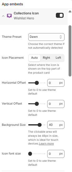
What does the Collections Icon embed do?
The Collections Icon app embed puts a wishlist icon on product cards in collections, search results, and filter results. Shoppers tap it to save the product without opening it. This page documents every setting in the embed and what it changes.
How the embed works
- For your theme it looks up three values from a built-in preset table: which element is a product card, where the icon anchors inside the card, and how to insert it
- It inserts one floating icon per card in icon only mode, marked with the collection view, and asks the app script to hydrate it
- It watches for cards that appear later through pagination or filtering, and adds icons to those too
- When no preset matches your theme, the card selector falls back to
.card-wrapper.product-card-wrapper - If icons don’t appear on your theme, set up the card selector under Manual setup: Wishlist button missing
Theme Preset
customThemeName , select, default Auto Detected / default. Chooses the built-in preset with the card selector, icon anchor, and insertion mode for your theme. The detection is separate from the other blocks’ presets and affects collection icons only.
Icon placement and size
| Setting | Setting ID | Type | Default |
|---|---|---|---|
| Icon Placement | wlIconPlacementInCard |
Select | Auto |
| Horizontal Offset | iconHorizontalOffset |
Range, -50 to 50 px | 0 |
| Vertical Offset | iconVerticalOffset |
Range, -50 to 50 px | 0 |
| Background Size | iconBackgroundSize |
Range, 20 to 48 px | 40 |
| Icon font size | iconFontSize |
Range, 0 to 50 px | 0 |
Icon Placement
Where the icon sits across the top area of the card. Right and Left pin the icon to that edge of the card; Auto uses the theme preset’s position.
Horizontal Offset
Nudges the icon horizontally, applied as an inline margin on the floating icon. The range runs from -50 to 50 px; 0 uses the theme default.
Vertical Offset
Nudges the icon vertically, applied as a block margin on the floating icon. The range runs from -50 to 50 px; 0 uses the theme default.
Background Size
Width and height of the icon’s round background. The clickable area stays 48 px, so the icon meets mobile tap target sizes even at smaller background sizes.
Icon font size
Size of the glyph inside the background. At 0 the glyph uses the theme default size.
Customize Button Colors
These colors override the app’s collection icon colors for this theme only. To change colors across all themes, use the app’s collection configuration screens.
| Setting | Setting ID | Type | Default |
|---|---|---|---|
| Enable | enableCustomColors |
Checkbox | Off |
| Icon | wishlistIconColor |
Color | Empty |
| Icon background | wishlistIconBgColor |
Color | Empty |
| Background Opacity | wishlistIconBgColorAlpha |
Range, 0 to 100% | 100% |
| Icon (In Wishlist) | addedWishlistIconColor |
Color | Empty |
| Icon background (In Wishlist) | addedWishlistIconBgColor |
Color | Empty |
| Background Opacity (In Wishlist) | addedWishlistIconBgColorAlpha |
Range, 0 to 100% | 100% |
Enable
Gate for the colors below. Until you turn it on, the app uses its configured colors and the color pickers change nothing.
Icon and Icon background
Color of the glyph and its round background before the product is saved. Published as CollectionViewIconColor and CollectionViewIconBackgroundColor .
Background Opacity
Transparency of the icon background, from 0 to 100% in steps of 5.
Icon (In Wishlist) and Icon background (In Wishlist)
The same glyph and background values for the state after the product is in the shopper’s wishlist. Published as CollectionViewAddedToWishlistIconColor and CollectionViewAddedToWishlistIconBackgroundColor , with their own opacity slider.
All colors are converted to rgba() values and merged into the app configuration. The embed then fires a wishlist-hero-colors-updated event, so open widgets pick the colors up without a page reload.
Manual setup
Use these settings when the icon doesn’t appear on your theme automatically. Set at least the Product Card Selector. If you need help, contact support.
| Setting | Setting ID | Type | Default |
|---|---|---|---|
| Product Card Selector | wlCollectionCardSelectorClass |
Text | Empty |
| Icon Location (optional) | wlIconPlacementInCardSelector |
Text | Empty |
| Icon Placement | wlIconPlacementInCardMode |
Select | First Child below |
| Product Link (optional) | wlProductHandleExtractor |
Text | Empty |
| Use more eager loading for the icon | enableSortMutation |
Checkbox | Off |
Product Card Selector
A CSS selector that matches every product card in the grid, for example .my-theme .product-card . It overrides the theme preset’s selector.
Icon Location (optional)
A selector for the element inside the card that the icon anchors to, usually the image wrapper. When empty, the icon anchors to the card itself.
Icon Placement mode
How the icon is inserted relative to the element above. The customizer label is Icon Placement, with three options:
- First Child below: the icon becomes the first child inside the anchor element
- Before the selector: the icon is inserted before the anchor element
- After the selector: the icon is inserted after the anchor element
Product Link (optional)
Overrides how the app finds the product link inside a card. The app normally looks for a link whose URL contains /products/ on its own; use this only when that detection picks the wrong element.
Use more eager loading for the icon
Adds a watcher on the product grid that re-adds icons after the theme re-renders it, for example when sorting or filtering. Enable it only when icons don’t refresh after those actions, because it adds work on every grid change.
Search & filter app preset
searchAndFilterApp , select, default None. Search and filter apps re-render results with their own card markup, so the wishlist icon doesn’t appear there by default. Pick your app, and the embed adds its card selector alongside your theme’s:
| App | Selector added |
|---|---|
| AI Search, Filter & Recommend by Boost | .boost-sd__product-item |
| Algolia Search and Discovery | .ais-product |
| Smart Product Filter & Search by Globo | .spf-product-card |
| Smart Search Bar & Filter by Searchanise | .snize-product |
| Smart Search & Product Filter by SoBooster | .usf-sr-product |
| Sparq Product Filter & Search | .sq-results-item |
Related pages